Polski
  Deutsch
The i-systems offer has been extended to include another novelty – optimizing the size of the loaded images.
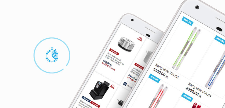
Until recently, all banners, graphics, and photos were loaded responsively, which means they scaled automatically by adjusting to the size of the screen. However, the size of the image remained the same, regardless of the device. For example: a large image was loaded onto a smartphone, hence the loading time could have been longer. In addition, Responsive Web Design has become a standard solution, so i-systems has made a further improvement.
At present, a change has been introduced, dedicated to loading photos of products, as well as any images in the online store, adjusted to a specific mobile device. This allows the online store to load much faster on mobile devices, because smaller images are loaded to fit the screen size.
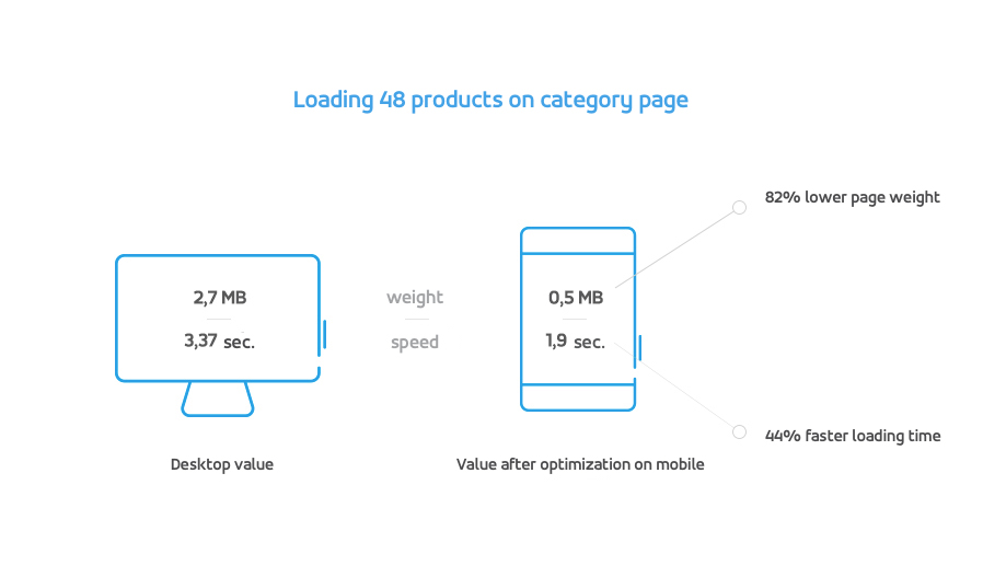
The graphic depicts how the speed and weight of loading the 48 products in the category page are changing. In the case of a desktop category page weight of 2.7 MB, after optimization on a mobile device, it decreases to 0.5 MB, which means that the page weight is reduced by 82%. Similarly, the page loading speed changes, which in the case of the desktop is 3.37 seconds, and after optimization on the mobile device, it is 44% faster.
For high-resolution HiDPI screens, the so-called Retina, there is a significant improvement in image quality. In addition, there is the option of turning off quality to significantly speed up the store loading on these devices. The store administrator determines what is the priority when loading photos (quality or speed).
In the near future, the new solution can allow mobile browsers to decide whether to load sharp images (when connected to wifi) or poor quality, but faster (using 3G) or personalized phone settings.